A Replicable Method for Gathering, Analysing and Visualising Podcast Episode and Review Data - Part 3
Rate and Review - Part 3
This post is the third in a series of four that present a workflow for gathering, analysing and visualising data about podcasts. The work presented here builds on Part 1 and Part 2. It is recommended that you complete the work in Part 1 and Part 2 before attempting the work in this post.
Please feel free to drop me a line if you have any questions about it, or if you would like to discuss ways we can work together.
1 Load Packages and Data
First, we need to load a number of packages and the data created in Part 2 of this tutorial .
library(tidyverse)
reviews <- readRDS("reviews_processed.rds") ##IS THIS WHAT IT CALLED IN PT2
episode_data <- readRDS('episode_data.rds')
reviews <- readRDS("reviews_for_article.rds")
2 Prep data for visualisation
There are some small pieces of housekeeping and some new variables to create in order to help with the visualisation process.
Firstly, the names of some podcasts are quite long, and this will create problems when visualising. We can create a new variable that takes only the first 10 characters of a podcast name. This will be enough to identify a given podcast in the visualisations that following later.
reviews$short_name <- substr(reviews$podcast, 1, 10)Next, we want to identify which of the Topics allocated in Part 2 are associated with which each podcast, regardless of the allocation given to an invidual review by the Topic Modelling process. The code below will create a new variable - main_topic - which will take an average of all allocations for each podcast and select the Topic most closely associated with it.
NB: The first line of the code below is based on 7 topics - which is why columns 18:24 are selected. If in Part 2 you selected a different number of topics, you will need to specify the corresponding range of columns. For example, if you selected 4 topics you will need to amend the code to 18:21. And so on.
topic_averages <- aggregate(reviews[, 18:24], list(reviews$podcast), mean)
topic_averages$topic <- colnames(topic_averages)[apply(topic_averages,1,which.max)]

for (i in 1:nrow(reviews)) {
  name <- reviews$podcast[[i]]
  topic_averages_new <- topic_averages %>%
    filter(Group.1 == name)
  reviews$main_topic[[i]] <- topic_averages_new$topic
  rm(topic_averages_new)
}
reviews$main_topic <- unlist(reviews$main_topic)
In the previous post, the podcast reviews being studied we allocated 7 topics, each of which were interpreted by the research team and given titles. The code below assigns those titles to the main_topic_name variable, which alongside the shortened podcast titles can help produce more easy to read visualisations.
If you are using this code in your own work, you will need to amend it to match the number of topics you have selected and the broad titles you have given to each topic.
factorise_topic <- function(x) {
  case_when(x %in% c('V1') ~ "Routine",
            x %in% c('V2') ~ "Experience",
            x %in% c('V3') ~ "Knowledge",
            x %in% c('V4') ~ "Format",
            x %in% c('V5') ~ "Pleasure",
            x %in% c('V6') ~ "Celebrity",
            x %in% c('V7') ~ "Fandom")
}

reviews$main_topic_name <- sapply(reviews$main_topic, factorise_topic)
reviews$main_topic_name <- factor(reviews$main_topic_name, levels = c("Routine",
                                                                      "Experience", "Knowledge",
                                                                      "Format", "Pleasure",
                                                                      "Celebrity", "Fandom"))
Similarly, the topic allocation for each individual review can also be given a title. Once again, amend this code to match your own process from Part 2.
factorise_review <- function(x) {
  case_when(x %in% 1 ~ "Routine",
            x %in% 2 ~ "Experience",
            x %in% 3 ~ "Knowledge",
            x %in% 4 ~ "Format",
            x %in% 5 ~ "Pleasure",
            x %in% 6 ~ "Celebrity",
            x %in% 7 ~ "Fandom")
}

reviews$topicsLDA7 <- sapply(reviews$topicsLDA7, factorise_review)
reviews$topicsLDA7 <- factor(reviews$topicsLDA7, levels = c("Routine", "Experience", "Knowledge",
                                                "Format", "Pleasure",
                                                "Celebrity", "Fandom"))
The Sentiment Analysis scores created in Part 2 can also be given names to aid visualisations, splitting them into three categories of Positive, Negative or Neutral.
reviews$sent_name <- ifelse(reviews$sent_by_word > 0, "Positive",
                          ifelse(reviews$sent_by_word < 0, "Negative",
                                 ifelse(reviews$sent_by_word == 0, "Neutral",
                                        NA  ))) # all other values map to NA
You may also like to add the overall topic allocations to the episode data gathered in Part 1. The process is similar to the above and generates a new variable in that dataset that contains the main topic allocation for each podcast.
for (i in 1:nrow(episode_data)) {
  name <- episode_data$podcast[[i]]
  topic_averages_new <- topic_averages %>%
    filter(Group.1 == name)
  episode_data$main_topic[[i]] <- topic_averages_new$topic
  rm(topic_averages_new)
}

episode_data$main_topic <- unlist(episode_data$main_topic)

episode_data$main_topic_name <- sapply(episode_data$main_topic, factorise_topic)
episode_data$main_topic_name <- factor(episode_data$main_topic_name, levels = c("Routine",
                                                                                "Experience", "Knowledge",
                                                                                "Format", "Pleasure",
                                                                                "Emotion", "Fandom"))
Finally, and as an optinal extra, we can set some parameters for visualisions that follow. I like to use the minimal theme, which seems to struggle with placing the legend information at the top of plots - where I think they look slightly better.
new_theme <- theme_minimal() %+replace%
  theme(legend.position = "top")
theme_set(new_theme)
3: Basic Visualisations.
Firstly, we can look at the number of reviews allocated to each topic.
reviews %>%
  ggplot()+
  aes(topicsLDA7,fill=factor(topicsLDA7))+
  geom_bar() +
  coord_flip() +
  scale_fill_brewer(palette = "Set1") +
  theme(axis.title.x=element_blank(),
        axis.title.y=element_blank()) +
  guides(fill=guide_legend(title="Topic"))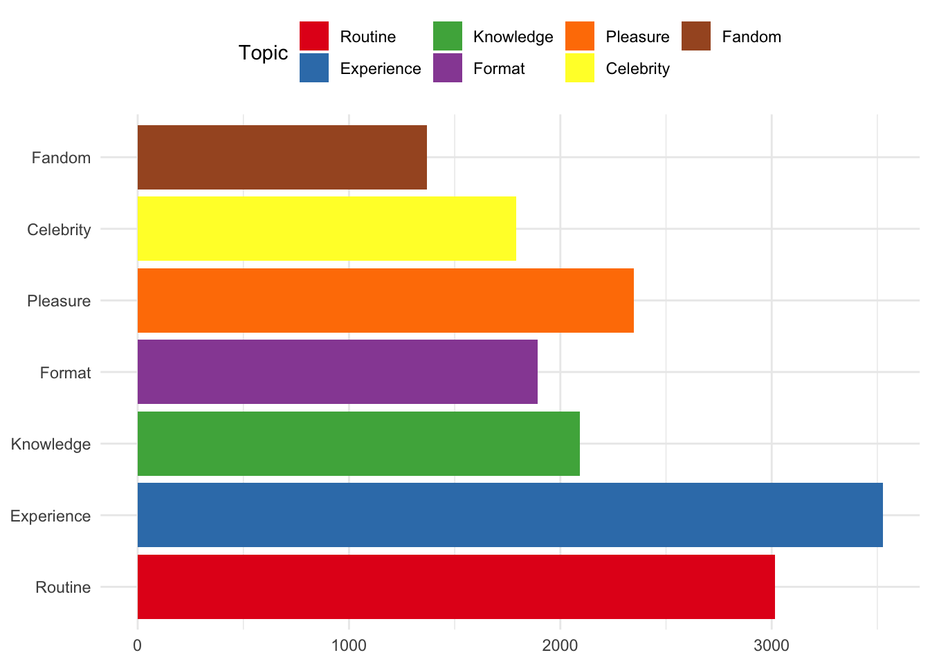
Or, look at the number of reviews for each podcast according to the main topic allocation.
reviews %>%
  ggplot() +
  aes(x=reorder(short_name, short_name, function(x) length(x))) +
  geom_bar(aes(fill = factor(main_topic_name))) +
  coord_flip() +
  scale_fill_brewer(palette = "Set1") +
  theme(axis.title.x=element_blank(),
        axis.title.y=element_blank()) +
guides(fill=guide_legend(title="Topic")) 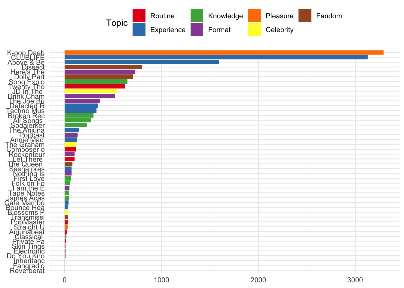
The same information is visualised below according to the topics allocted to individual review for each podcast.
reviews %>%
  ggplot() +
  aes(x=reorder(short_name, short_name, function(x) length(x))) +
  geom_bar(aes(fill = factor(topicsLDA7))) +
  coord_flip() +
  scale_fill_brewer(palette = "Set1") +
  theme(axis.title.x=element_blank(),
        axis.title.y=element_blank()) +
  guides(fill=guide_legend(title="Topic"))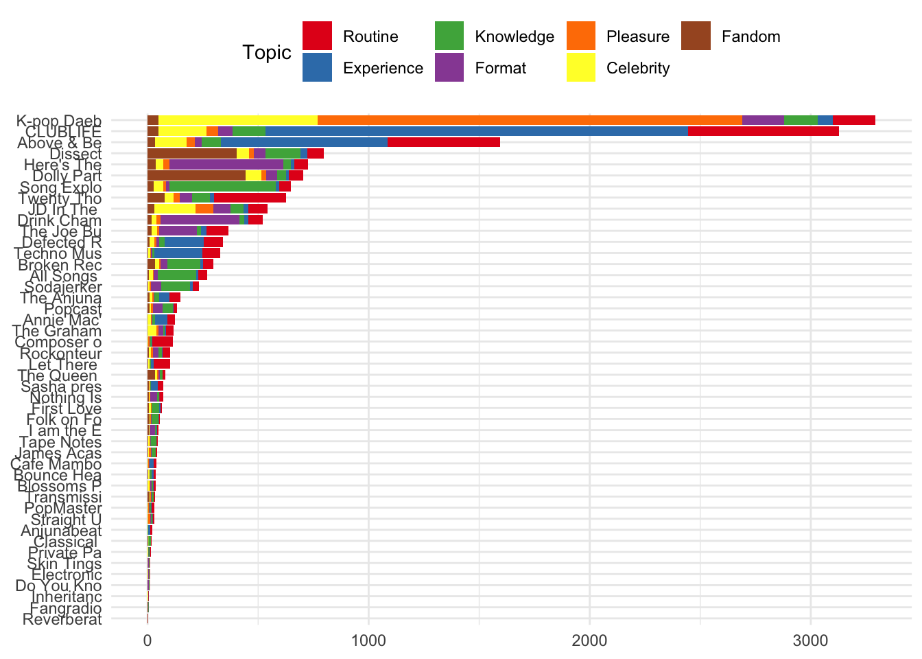
Or, perhaps more usefully, the proportion of all reviews for each podcast they were allocated to a given topic.
reviews %>%
  ggplot()+
  aes(x = short_name, fill = factor(topicsLDA7)) +
  geom_bar(position = "fill") +
  scale_fill_brewer(palette = "Set1") +
  coord_flip() +
  guides(fill=guide_legend(title="Topic")) +
  theme(axis.title.x=element_blank(),
        axis.title.y=element_blank())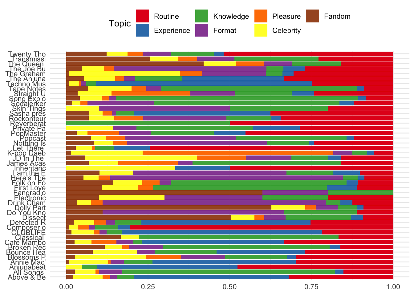
The same information can be shown using the Sentiment Analysis scores, highlighting which podcasts recieved a higher proportion of negatively scored reviews.
reviews %>%
  ggplot()+
  aes(x = short_name, fill = factor(sent_name)) +
  geom_bar(position = "fill") +
  scale_fill_brewer(palette = "Set2") +
  coord_flip() +
  theme(axis.title.x=element_blank(),
        axis.title.y=element_blank()) +
  guides(fill=guide_legend(title="Sentiment"))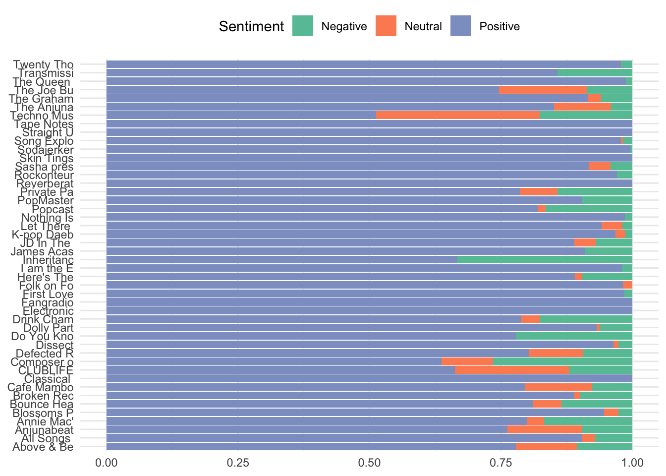
Using the facet wrap function, the number of reviews allocated to given topics can be visualised according to the sequential order of reviews over time.
reviews %>%
  ggplot() +
  aes(date, review_id) +
  geom_jitter(aes(colour = main_topic_name)) +
  scale_colour_brewer(palette = "Set1", name = 'Main Topic') +
  facet_wrap(~main_topic_name) +
    theme(axis.title.x=element_blank(),
        axis.title.y=element_blank())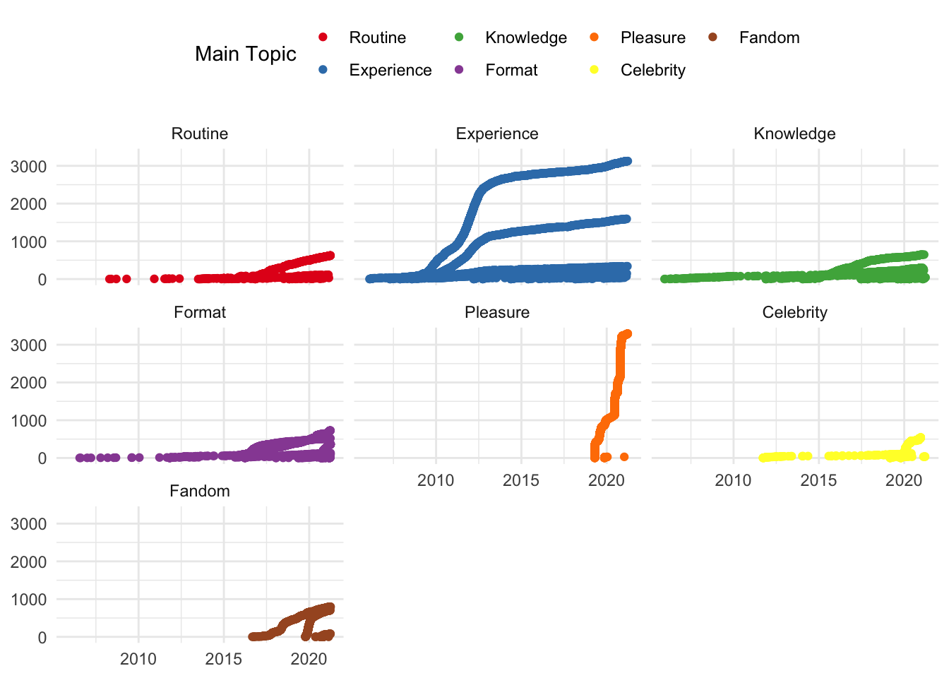
And similarly, the same information can be shown according to Sentiment Analysis scores in each topic.
reviews %>%
  ggplot() +
  aes(date, sent_by_word) +
  geom_jitter(aes(colour = main_topic_name)) +
  scale_colour_brewer(palette = "Set1", name = 'Main Topic') +
  facet_wrap(~main_topic_name) +
  theme(axis.title.x=element_blank(),
        axis.title.y=element_blank())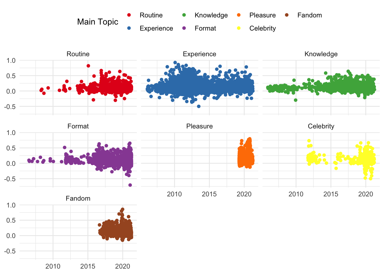
The visualisations shown in this section are merely indicative of what can be done with the review data set collected and analysed. Similar visualisations can be created using the episode data set. The objective of creating these visualisations is to explore the contents of the dataset in order to help formulate or answer questions about a given set of podcast review/episode data.
The main issue with these visualisations, however, is that they are static. In order to - for example - explore results for a given podcast, a given topic, or a given time period, the researcher would need to add certain filters to the code provided above to create a new visualisation. They would also need to then subject the reviews concerned to a more close reading to explore whether the contents supported an observation that a visualisation may suggest.
In the final part of this tutorial series, I will walk through the process of using the data collected and analysed in Parts 1 and 2 to render the visualisations created in this part as an interactive document. This will enable reserachers to explore the contents of the reviews gathered alondside the results of the various analyses and visualisations.
4: Write out the data
Because we have made some changes to the datasets generated in Parts 1 and 2, we can write them out at this stage so that they can be used in Part 4.
write_rds(reviews_new, "reviews.rds")
write_rds(episode_data, 'episode_data.rds')Dr Craig Hamilton
My research interests include popular music, digital humanities and online cultures.